I’m back with another post, this time exploring a new CSS framework, Tailwind CSS!
In the previous months I started using Angular and Typescript for some small web apps and dashboards, but I always found CSS management cumbersome. I could spend hours tweaking font-size and align-items parameters and hard-coding variables, and this wasn’t a lot of fun.
That’s why I decided to try Tailwind, which is being heavily recommended by many people in the frontend community! I just needed the right idea before starting to code…
📊 The Dashboard
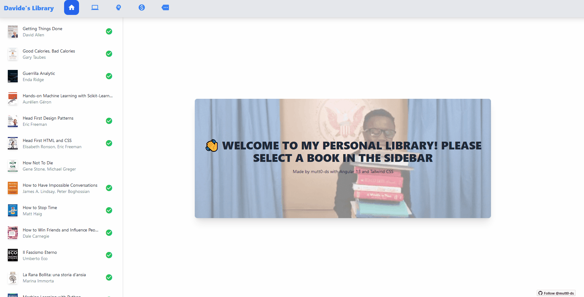
The idea was: I want to show the books I’ve been reading, with a nice UI!
I deployed a live demo of my dashboard on Netlify, while if you are interested in the code, the public repository is here.

📚 The Dataset: My Books
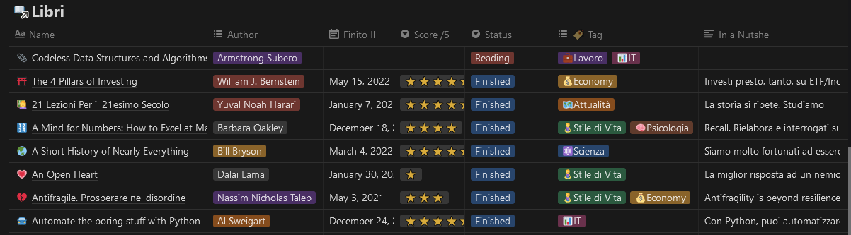
For my experiment, I wanted to create something unique, not clones of existing websites or basic pages. Since I’m already keeping trace of the books I’m reading on a Notion Database, I exported the data from the past two years and used it as a small dataset. I would have liked to include my detailed notes, but since I write them only for personal use they were an embarrassing hybrid of Italo-English which was taking too long for a complete translation. This wasn’t a data cleaning project!
Thus I only used the columns Rating (1-5 ⭐), Brief Recap (a couple of lines I write for quickly presenting the book), Category, Author, Title and Date.
📦 Angular + tilt.js
The project has been created using the Angular CLI, and I kept it really simple: there are 3 components.
- The header, where the user can filter the category of the books
- The sidebar, for selecting the books from a list
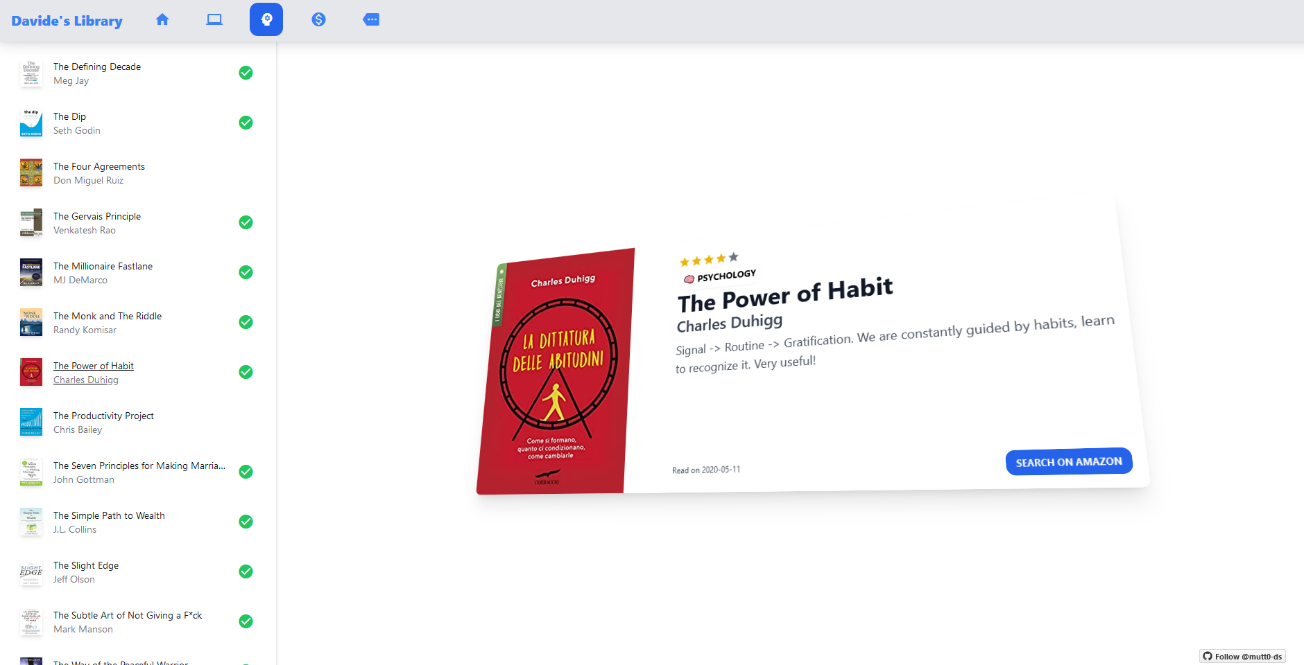
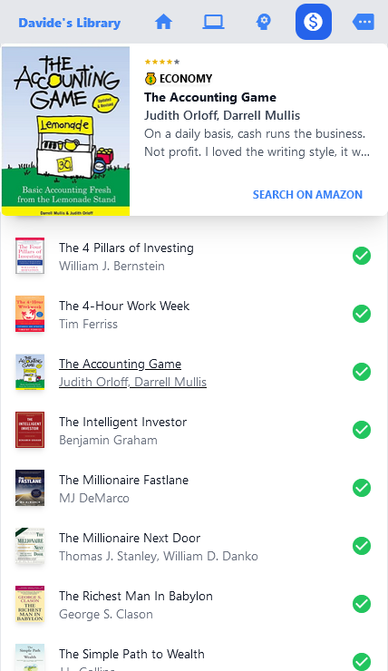
- The book component, showing the Book Card with some info about the item
The most complex part, because I somehow managed to overcomplicate things, was to read and clean the data from the Notion export. It was just a small CSV, but as I said my notes were a bit messy so I cleaned them directly after the import.
I also wanted to have fun with a nice little library called vanilla-tilt.js, which gives that modern tilting effect to the Book Card.
🌬️ But why Tailwind?
I started with the header and I immediately loved using Tailwind:
<div
  class="sticky top-0 left-0 h-12 md:h-16 w-screen bg-gray-200 shadow-lg z-10"
>
  <div class="max-w-xl flex flex-row">
    <h1
      class="flex items-center mx-5 md:text-xl text-sm text-blue-500 font-extrabold"
    >
      Davide's Library
    </h1>
  </div>
</div>
If you aren’t used to Tailwind’s unique paradigm, this may look messy. But in three lines the header was ready. Every class represented a CSS property: for example I wanted the header to be sticky at the top, so I gave it the sticky, top: 0, left: 0 CSS properties using Tailwind classes. It’s very intuitive.
I also didn’t waste time with shadows: I applied the beautiful shadow-lg class and everything was ready.
If you were wondering, bg-gray-200 and text-blue-500 are properties for defining the colors of the background and the text, using a default palette which I could configure in the settings.
In the first hour I was a bit scared to create a monster with several lines of classes in my code, but in the end I found so useful to have HTML and CSS together in a single file. Everything was more intuitive, and I didn’t even have to tweak many Tailwind settings, except for a couple of animations I wanted to use. The default classes were already enough for such a simple site.
📱 Mobile Responsive you say?
I quickly deployed the webpage using the Netlify CLI and, excited, I sent it via Whatsapp to a friend… Forgetting that I didn’t optimize it for mobile! He saw a messy screen because the Book Card was hovering over the sidebar and the header icons were too big.
It’s no use crying over spilled milk. Sobbing, I started to see how to optimize a mobile-responsive design with Tailwind.
It was embarrassingly trivial.
I will use this code for the book card as an example: I wanted to display it right under the header if the screen was small (‘md:’ prefix in Tailwind means screen-size at most 1024px wide). On mobile, this avoids the issue of the card covering the sidebar, making some options unselectable.
class="fixed md:top-1/3 md:w-1/2 md:h-96 lg:left-1/3 h-auto w-screen shadow-xl
bg-white rounded-lg overflow-hidden z-10" *ngIf="!selectedBook"
So, if a book is selected (thus the presence of Angular’s *ngIf), based on the screen size of the device the page renders the card in the upper part of the screen with a fixed small height for keeping the proportions correct. If the device is large, the card starts to float in the right section of the screen with a bigger height.
Other options included a white background, rounded corner, z-index of 10 and hidden overflow. The result isn’t an amazing example of UI design, but I achieved my objective in 5 minutes straight with just a few classes: the sidebar was clickable and the card was easy to read.
Conclusions
There are lots of posts explaining why Tailwind CSS is a great framework, such as this one and this one, showing more technical details such as PurgeCSS or how to enable dark mode. I wanted to add my personal experience.
With small projects like my Book Library, it was easy to keep trace of all the long lines full of classes that I had to use for styling the HTML page, and, most importantly, I had a lot of fun while working. I loved the way I was already used to such a disruptive approach after only a few minutes of coding, how the IDE helped me with IntelliSense, how quickly the result started to look good. Tailwind improved my performance by about 20%/30%, since I spend lots of time tweaking my CSS.
It may be counter-intuitive to use it in larger projects, where the bloated HTML could create confusion, but that’s a choice I don’t have to take right now. For the sake of truth, I recommend this article showing a different opinion. I agree that the framework is going to add a layer of complexity and problems, but considering that styling isn’t my personal priority and I just want something quick and easy to use, I’m comfortable with that.
I’ll keep using Tailwind in my future projects after this positive experience.